Vrark

Member
Vrark submitted a new resource:

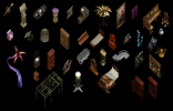
Rendered art - 3D rendered sprites.

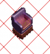
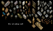
After a lot of trial and error, I have finally managed to figure out how to render 3D models in Blener to fit the isometric view UO uses. So I am uploading these few sprites now, just to see if it's something people would be interested in using. If so, I will be able to render a lot of sprites. Like hundreds. I just don't want to spend a lot of time on rendering them if there is no interest in using them. So, some feedback will be appreciated. :)
View attachment 20228

Read more about this resource...
 
First of all gr8 work
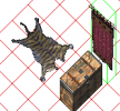
the chest fits the settings close to perfect (cept a few small pixel errors that are easy to clean) maybe a bit blury but also easy to fix
the other three i checked are a bit off of the lines they should fit in the grid . using 3d redered items and fitting them into the grid is really hard most of the time they wont fit perfectly but can be reworked to do so
pls keep the work up ^^ really looks nice so far :)
1653815830451.png1653815716140.png
If you got "flat items" like banner, carpets/rugs its easyer to view them flatfront or top view and just tilt them in photoshop to fit the grid
 
i know karate and some other Japanese words.
i will bump your head in future about how to do some of these if u dont mind
 
First of all gr8 work
the chest fits the settings close to perfect (cept a few small pixel errors that are easy to clean) maybe a bit blury but also easy to fix
the other three i checked are a bit off of the lines they should fit in the grid . using 3d redered items and fitting them into the grid is really hard most of the time they wont fit perfectly but can be reworked to do so
pls keep the work up ^^ really looks nice so far :)
View attachment 20230View attachment 20229
If you got "flat items" like banner, carpets/rugs its easyer to view them flatfront or top view and just tilt them in photoshop to fit the grid
Thank you for the feedback! The chest is actually an older render that I rendered long ago, and didn't check while I posted this. I am adding the new renders to Fiddler and checking them for pixel errors, so normally I will notice the errors. I just don't always try and add them in the game, because it can be rather time consuming if I am to render hundreds of sprites. :oops:
As for the perspective problems on the other ones it is mostly because I don't fully understand the X and Y aspect settings in Blender. I will try testing it some more and hopefully get results that doesn't need any post-work. The chair I had to distort in Photoshop, and some items looks really strange when I render them. Mostly round objects will become more oval. I will continue trying and post some more! :D
 
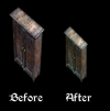
I think I've figured it out now. The reason why my first ones weren't correct is that I did not set the correct number on the camera's orthographic scale.
Wardrobe compare.png
 
So my next step is to start rendering some more sprites and upload them here. If someone wants to test them I'd be grateful. And any feedback is appreciated. :)
 
My shards will back you up and start testing.
Thank you very much!
I will be updating this post with new sprites that can actually be used, soon. :)
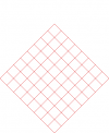
No need to add in game for testing just cut out and pull on this grid :)

View attachment 20237
Thank you for this. I had already made a similar grid, but this is much better!
I will still need to test my sprites in Fiddler for pixel errors though, as they are not easy to spot in Photoshop. :oops:
So what was the process for doing all of this? I have wanted dabble in this for some time...
I start out by loading up my model in Daz Studio, then export it as a .dae file. For other programs I guess you can use .fbx, but I've found .dae to be more reliable when it comes to Daz Studio. I then have a custom blender scene that I import my .dae file into, and after that I just have to render, and if needed, rotate the model and render again.
After the sprites are rendered I just finish them up in Photoshop and save them as .bmp files to import to Fiddler. I prefer the sprites to be rendered a bit bigger, so I set my render size to 400x400 pixels in Blender. I do have to downscale the sprites in Photoshop then, but that's not really a problem. :D
I can upload my blender file if you'd like to try this. :)
 
Last edited:
So, I have now spent several hours rendering a lot of sprites and editing them in Photoshop. Next step is to scale them and place them on the grid, and then try adding them to Fiddler to check for pixel errors.
I'm actually a bit surprised how well most of them fits the UO graphic style. I had thought it would look too 'realistic' for the style, but I don't think it's that bad really.

Misc renders 01.png
 
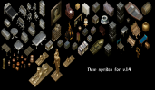
Alright, I now posted a new version of the sprites with a file containing over 100 sprites. I hope someone will be so kind to test them in the game, as I haven't done that yet. :)
 
From now on I will be posting updates when I upload a new version of the file.
Eventually this will become a very large archive, so I am considering dividing it into multiple parts. I've only created 200 sprites now, which is a fraction of what I am able to create with all the models I have. I have been using Daz Studio (and before that, Poser) for almost 20 years so I have accumulated quite a lot of 3D models over the years. :D
And the good thing is that even though some of the models I'm rendering are also very old, when they get scaled down, they look good enough for this kind of stuff.
 
That will be quite a task, and unfortunately, I have no idea how to script. I can add them to the art files, but that's about it.
the one thing I hate about adding to the art files though is that if UO updates you either miss out on all the new stuff or you have to redo it every time, I wish there was an easier way! I can script them I'm just being lazy lol, and as I say that I just finished coding 32 new vendors XD
 
Daz Studio aye? I've been trying to figure out what that program was for about a year im downloading right now should be fun!!! so it's daz combined with photoshop and fiddler... seems like a cool new tool instead of just drawing the stuff by hand can't wait to try myself.
 
Some of these will require repairs as they have black and white values that register transparent. Didn't check them all just a few.
Also the furniture pieces must be spliced. Then scripted into addons if desired for players. Did one for the hell of it 1654083034410.png
1654083059586.png
 
Daz Studio aye? I've been trying to figure out what that program was for about a year im downloading right now should be fun!!! so it's daz combined with photoshop and fiddler... seems like a cool new tool instead of just drawing the stuff by hand can't wait to try myself.
Besides that, I also use Blender for the rendering, as I haven’t figured out how to use the right perspective in Daz Studio. I’m not even sure if it’s possible.
I can upload my Blender file if it’s something you’re interested in trying.
Some of these will require repairs as they have black and white values that register transparent. Didn't check them all just a few.
Also the furniture pieces must be spliced. Then scripted into addons if desired for players. Did one for the hell of it View attachment 20248
View attachment 20249
Yeah, I was afraid some of it was too big to be used as is.
I am testing every sprite in Fiddler, and didn’t notice any black pixels. And the white isn’t easy to spot in Fiddler. I guess they are easier to see inside the game. But for me to test that, I will have to add each sprite as items, which will take a lot of time.
 
Some of these will require repairs as they have black and white values that register transparent. Didn't check them all just a few.
Also the furniture pieces must be spliced. Then scripted into addons if desired for players. Did one for the hell of it View attachment 20248
View attachment 20249
I just tried adding some of the items to Fiddler and checked them in my game, and you're right; there are some bad pixels. I will fix them when I can. :D
 
Besides that, I also use Blender for the rendering, as I haven’t figured out how to use the right perspective in Daz Studio. I’m not even sure if it’s possible.
I can upload my Blender file if it’s something you’re interested in trying.

Yeah, I was afraid some of it was too big to be used as is.
I am testing every sprite in Fiddler, and didn’t notice any black pixels. And the white isn’t easy to spot in Fiddler. I guess they are easier to see inside the game. But for me to test that, I will have to add each sprite as items, which will take a lot of time.
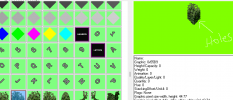
You can right click preview pane window and change background color this will reveal holes. You can then screen capture the version with holes. Patch them with working color value then paste over damaged version and reinstall.1654152947875.png
I like a lot of the objects but, the Hi-rez throws me off. It clashes and is jarring to me. New UO artists, even on the official server try harder and harder to make objects look more and more real. Like the newer MMOs. I do this in reverse. I make objects look more and more UOish. I do this by using UO textures ect in the new images. Always try to keep in mind the light source in UO is on the left shadow is on the right. I appreciate this resource. Gives me more objects to convert. Beautiful models the just need to be de glamoured in my opinion. Beauty is in the eye of the beholder. Many players would love these I am sure. I will be using a lot of this stuff. Thank you.
 
Last edited:
You can right click preview pane window and change background color this will reveal holes. You can then screen capture the version with holes. Patch them with working color value then paste over damaged version and reinstall.View attachment 20252
I like a lot of the objects but, the Hi-rez throws me off. It clashes and is jarring to me. New UO artists, even on the official server try harder and harder to make objects look more and more real. Like the newer MMOs. I do this in reverse. I make objects look more and more UOish. I do this by using UO textures ect in the new images. Always try to keep in mind the light source in UO is on the left shadow is on the right. I appreciate this resource. Gives me more objects to convert. Beautiful models the just need to be de glamoured in my opinion. Beauty is in the eye of the beholder. Many players would love these I am sure. I will be using a lot of this stuff. Thank you.
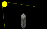
Thanks a lot for this! I didn't know you could change the background colour. This will help a lot. I will also have to tweak the light source to be from the left to the right. This might also fix the fact that a lot of the objects looks rather dark. I just noticed that my light setup was a bit strange. A sun node underneath the objects. :oops:
I will fiddle some more with this, and now that I can see the holes/black pixels better I can also fix that. Thanks again!
Now I just need to figure out how to go about slicing the larger sprites. I know how to slice up an image, but not where to actually do it on the sprites. Any tips would be welcome. :D
 
Yeah, I have done it similar to that. The shadows already look a lot better.
If it generates shadows turn them off. Only mobiles cast shadows. Object shading is ok where it darkens the right side. Just don't want any floor shadows.
 
If it generates shadows turn them off. Only mobiles cast shadows. Object shading is ok where it darkens the right side. Just don't want any floor shadows.
Ah, I was referring to the shadows on the object itself, not the ones that cast onto the ground. There are none of that, fortunately!
 

Active Shards

Donations

Total amount
$0.00
Goal
$1,000.00
Back