Some of you may be familiar with Djeryv's Spell Toolbar script. I decided to make some updates to it while implementing some changes as well.
Looking for some feedback, so let me know if there are any changes you'd like to see.
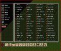
Here's the current combined gump I have going with Djervy's hotbar gump below it

As you can see, my spell selection gump uses the names of the spells instead of the spell icon. I felt this was a bit more 'user friendly'.
A change I'm thinking about working in is this

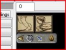
Removing the Spellbook image from the hotbar gump and instead adding an "options" below the spells.
The arrow is the minimize the hotbar/options bar, the question mark is for help (necessary?), the blue arrow is for possible making the hotbar flippable, so it can be horizontal or vertical, and the lock is to lock the hotbar so it can't be moved, closed, as well disabling the other option buttons.
Looking at it now I think it needs a blank space to be able to grab and move the whole hotbar section, but if I removed the (?) button then I could slide the others over.
EDIT: Forgot to ask, what are the maximum number of spell icons that should in one row?
I'm not entirely sure how I'd make it work, but I thinking of having 12 icons per row (sounds fairly typical for MMO hotbars, right?) and if the player selects more than 24, it will tell them to choose less.
Thoughts?
Looking for some feedback, so let me know if there are any changes you'd like to see.
Here's the current combined gump I have going with Djervy's hotbar gump below it

As you can see, my spell selection gump uses the names of the spells instead of the spell icon. I felt this was a bit more 'user friendly'.
A change I'm thinking about working in is this

Removing the Spellbook image from the hotbar gump and instead adding an "options" below the spells.
The arrow is the minimize the hotbar/options bar, the question mark is for help (necessary?), the blue arrow is for possible making the hotbar flippable, so it can be horizontal or vertical, and the lock is to lock the hotbar so it can't be moved, closed, as well disabling the other option buttons.
Looking at it now I think it needs a blank space to be able to grab and move the whole hotbar section, but if I removed the (?) button then I could slide the others over.
EDIT: Forgot to ask, what are the maximum number of spell icons that should in one row?
I'm not entirely sure how I'd make it work, but I thinking of having 12 icons per row (sounds fairly typical for MMO hotbars, right?) and if the player selects more than 24, it will tell them to choose less.
Thoughts?
Last edited:
